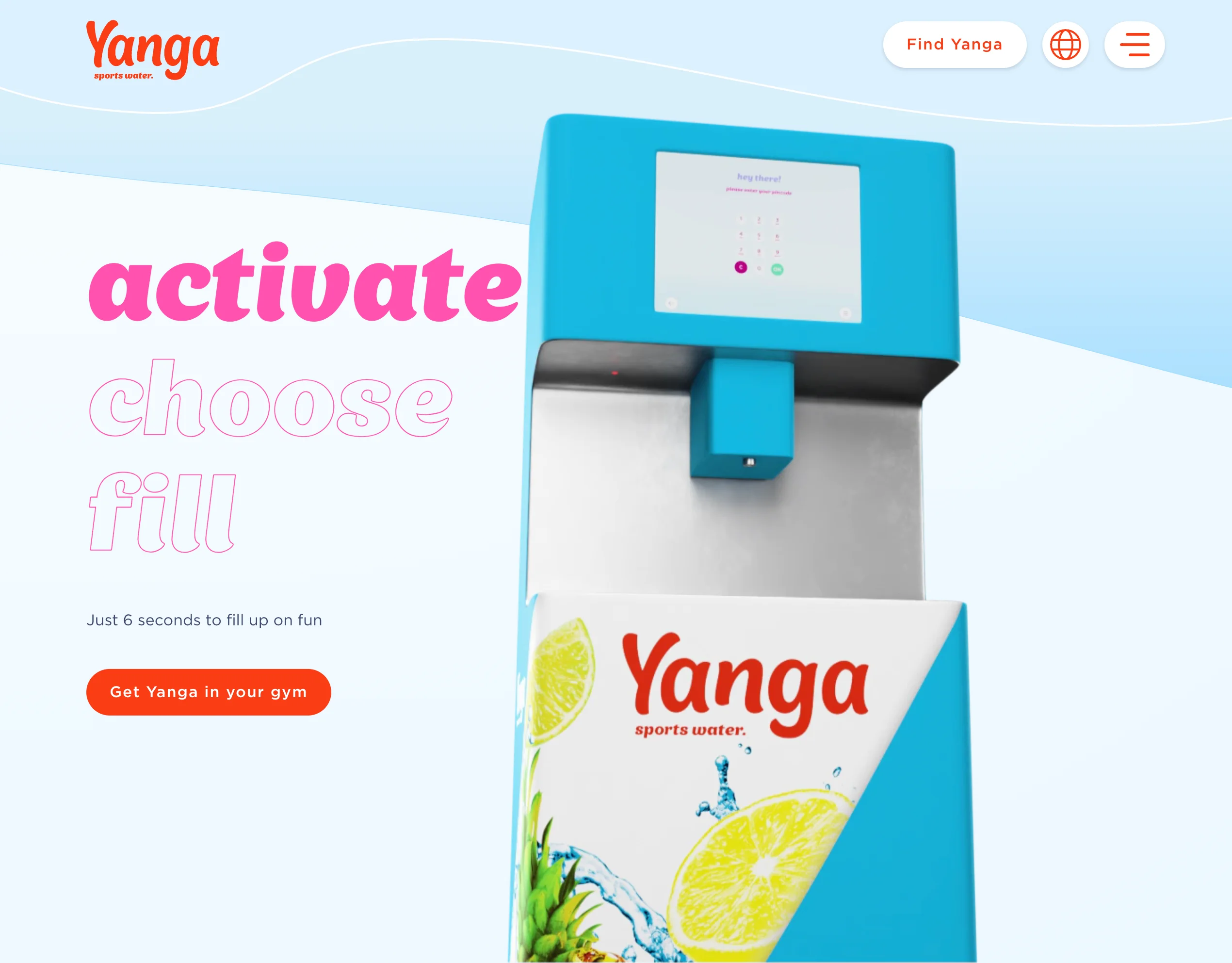
Yanga Sports Water machine interface redesign
 UX Design machine interface redesign
 Background
Yanga Sports Waters is an innovative brand focused on delivering high-quality sports drinks to fitness enthusiasts worldwide, catering to a wide range of cultures and needs. Our Yanga Sport Water Machines can be found in the Netherlands at renowned gyms such as Sportcity, Basic-Fit, and other fitness centers. What sets us apart from other sports drinks is our unique refillable system, adding an extra dimension of fun to every workout.
Design Challenge
The existing machines failed to embody the playful essence of the Yanga brand, and their interaction lacked engagement. A transformation was essential: the machine required a modern and playful redesign while retaining its user-friendliness. It was crucial to create an inviting atmosphere for new and existing customers to explore new flavors. With the replacement of the iPad-sized screen by a larger kiosk-sized screen, optimizing the utilization of the entire display became a significant challenge. Additionally, ensuring intuitive interaction was paramount. Users must effortlessly discern and understand the necessary actions, and the timing of those actions, guaranteeing a seamless and intuitive experience for all.

Research Process
As a designer with a genuine passion for understanding and studying human behavior, I devoted my efforts to comprehending the needs and preferences of various target demographics. My aim was to identify opportunities for enhancing product design and user experience. Beyond the immediate design challenge, I observed that the existing machine lacked accessibility for all users. The interaction screen for ordering sports drinks was positioned too high for individuals of smaller stature or those with disabilities.
Solution
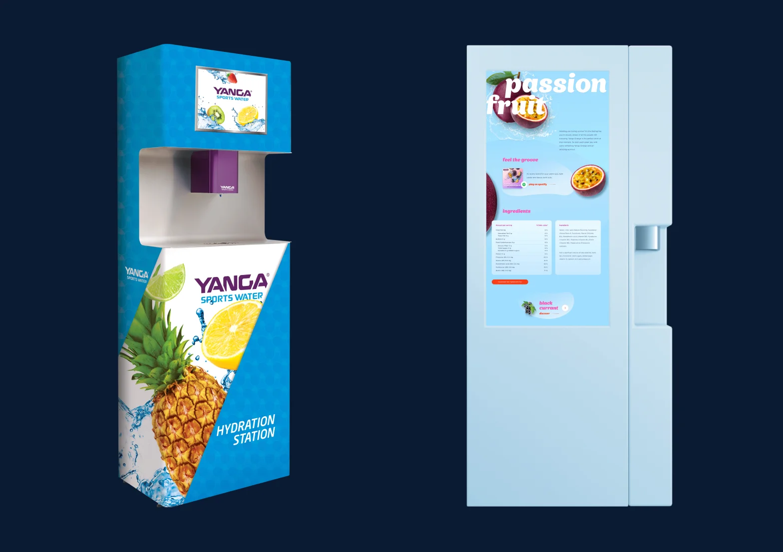
In addressing this challenge, my primary focus was on enhancing usability and accessibility to ensure inclusivity for all users. My objective was to develop a design that didn’t require a separate wheelchair button, thereby fostering a sense of equality. Throughout this process, I collaborated closely with the client to grasp their vision and brand identity, translating it into a design that not only fulfills customer needs but also enhances the overall fitness experience positively. Creating a universally appealing screen that also aligns with the playful Yanga brand presented a significant challenge, but it was successfully achieved. To measure the success of this endeavor, I conducted user testing with diverse participants to evaluate the effectiveness of my concept. The feedback from these tests was invaluable, highlighting areas for improvement that I might not have otherwise noticed. While the new screens won’t be deployed in Dutch gyms until next year, the designs I created are currently being implemented by developers. Although I can’t showcase the journey I designed, the image below illustrates the current machine on the left and the new machine on the right.
← back to portfolio